
The European Union gets major features with iOS 26.5 Beta 1
Juli Clover at MacRumors mentions all the new features as part of her iOS 26.5 Beta 1 coverage:
European Union Third-Party Wearable Changes
Apple is working on new interoperability features in the EU to comply with the requirements of the Digital Markets Act. Apple has tested these features in prior betas, but the Live Activity sharing feature is new.
Proximity pairing - Devices like earbuds will be able to pair with an iOS device in an AirPods-like way by bringing the accessory close to an iPhone or iPad to initiate a simple, one-tap pairing process. Pairing third-party devices will no longer require multiple steps.
Notifications - Third-party accessories like smart watches will be able to receive notifications from the iPhone. Users will be able to view and react to incoming notifications, which is a capability normally limited to the Apple Watch. Notifications can only be forwarded to one connected device at a time, and turning on notifications for a third-party device disables notifications to an Apple Watch. Notifications from select apps can be forwarded, or from all apps.
Live Activities - Live Activities are able to sync to a third-party wearable, similar to other notifications. This is a feature that appears to be new to iOS 26.5.
There's no word on when the EU third-party wearable features will launch, and Apple also tested them in the iOS 26.3 and iOS 26.4 betas before removing them when the software was released to the public.
Proximity pairing sounds neat and convenient, but Notifications and Live Activities on third-party smart watches sounds like a huge mess:
What if the manufacturer of a 3rd-party smartwatch releases an update that accidentally breaks iPhone notification compatibility?
With Apple Watch, you can pair up to 5 Apple Watches with one iPhone and easily switch them out to activate them, simply by wearing the other watch. Notifications only go to the Apple Watch you’re wearing. How smooth will the transition be when going from a 3rd-party watch to an Apple Watch or vice versa?
What 3rd party devices will be supported and for how many years? iPhone and Apple Watch compatibility already has a lot of tiers depending on how far back you go, but you almost need a Doctorate just to figure out if an iPhone and Apple Watch are compatible. I can’t even imagine how that will be for 3rd party devices.
How the iPhone’s Screenshot buttons came to be.
Heard this on The Talk Show a few days ago, but Imthaz at Volatile Inputs has the full transcript of that particular segment between John Gruber and David Pogue.
Heard this on The Talk Show a few days ago, but Imthaz at Volatile Inputs has the full transcript of that particular segment between John Gruber and David Pogue.
iPhone Clock icon transition right at daylight savings time.
Had to get up for work at 2:30am but that time didn’t exist last night, so I decided to get up at 1:55am and saw the clock transition from 1:59am to 3am. Nothing super special, but you have to wait 8 months to see a transition like this again.
Had to get up for work at 2:30am but that time didn’t exist last night, so I decided to get up at 1:55am and saw the clock transition from 1:59am to 3am. Nothing super special, but you have to wait 8 months to see a transition like this again.
You cannot jump to a specific page of a document in ‘Files’ but you can in ‘Preview.’
No matter which sub-menu you try, there is no “Go to page” option. You need the new Preview app in iOS 26 and then you’re allowed to go directly to a specific page number. 📓
No matter which sub-menu you try, there is no “Go to page” option. You need the new Preview app in iOS 26 and then you’re allowed to go directly to a specific page number. Kind of annoying because I like scanning my books as a backup, and it’s annoying to scroll hundreds of pages down to get to a specific page.
You need iOS 26 or iPadOS 26 to download the Preview app. The good thing is the Files app in iOS 26 gives you a Preview button at the bottom, making it one tap to jump right in.
To be clear, the Files app never had the “Go to page” option from what I can recall. I used an iPhone 14 with iOS 18 installed to confirm that Files does not have that option. You will need to upgrade to iOS 26 to get Preview or download a 3rd party app if your device doesn’t support iOS 26.

No matter which submenu you choose, you don’t get a “Go to page” option, but if you click Preview at the bottom…

The 3 dots in the top-right corner brings up the option to navigate to a specific page.
Apple’s new foldable iPhone needs to nail two key features in order to make it a success.
Those two features are:
Foldable display durability.
Amazing, intuitive software experience.
I’m not worried about the hinge durability since Apple has been making hinges for years and have some of the best hardware in the market. The main concern is with the foldable display.
Apple did innovate hard with Ceramic Shield 2, being 3x better at scratch resistance, and is the only phone with non-existent scratches on a level 6 to barely scratching at a level 7 on mohs scale of hardness. Every other mainstream and flagship phone scratches at a level 6 with deeper grooves at a level 7. I can’t imagine Apple will release a fragile inner display with a crease requiring a plastic screen protector prone to fingernail scratches. This is the harsh reality is even after 7 hardware iterations of the Samsung Galaxy Z Fold. Impressive and thin, but with an achilles heel.
Apple waits for technology to be set to a standard that meets their ethos before jumping in. It would be spitting in the face of Steve Jobs if they released a device with a plastic screen protector after he famously ordered a massive shift from plastic to glass in iPhone production the minute he noticed scratches on the display. Hopefully Apple’s continued investment in Corning will mitigate this issue and they have something up their sleeve that will wow us.
I’m also worried about the software experience, especially if we have the iPad to judge by. Having too many options for window layouts and multitasking would be cumbersome on a smaller screen, and hopefully Apple takes a play out of their playbook to make the software fun, simple, and intuitive. When iPhone X was released, it was a huge shift in usability with the removal of the Home Button, but it was once again fun, simple, and intuitive. Dynamic Island was also a new innovation at a smaller scale and followed the playbook, being a useful tool that I miss every time I go back to a notched iPhone.
Now what is my definition of success in this specific case? It’s not record sales numbers, but the ability to execute and make an experience that changes the game. I consider iPhone Air to be a success, because it shows you can make a durable and thin device that lasts all day at scale, something not possible a few years ago. A foldable phone doesn’t have to deliver on all technological fronts with the best cameras and the best battery life, but it needs to be durable like a regular phone, and it needs to have a software experience that makes sense and would make people jump at the opportunity.
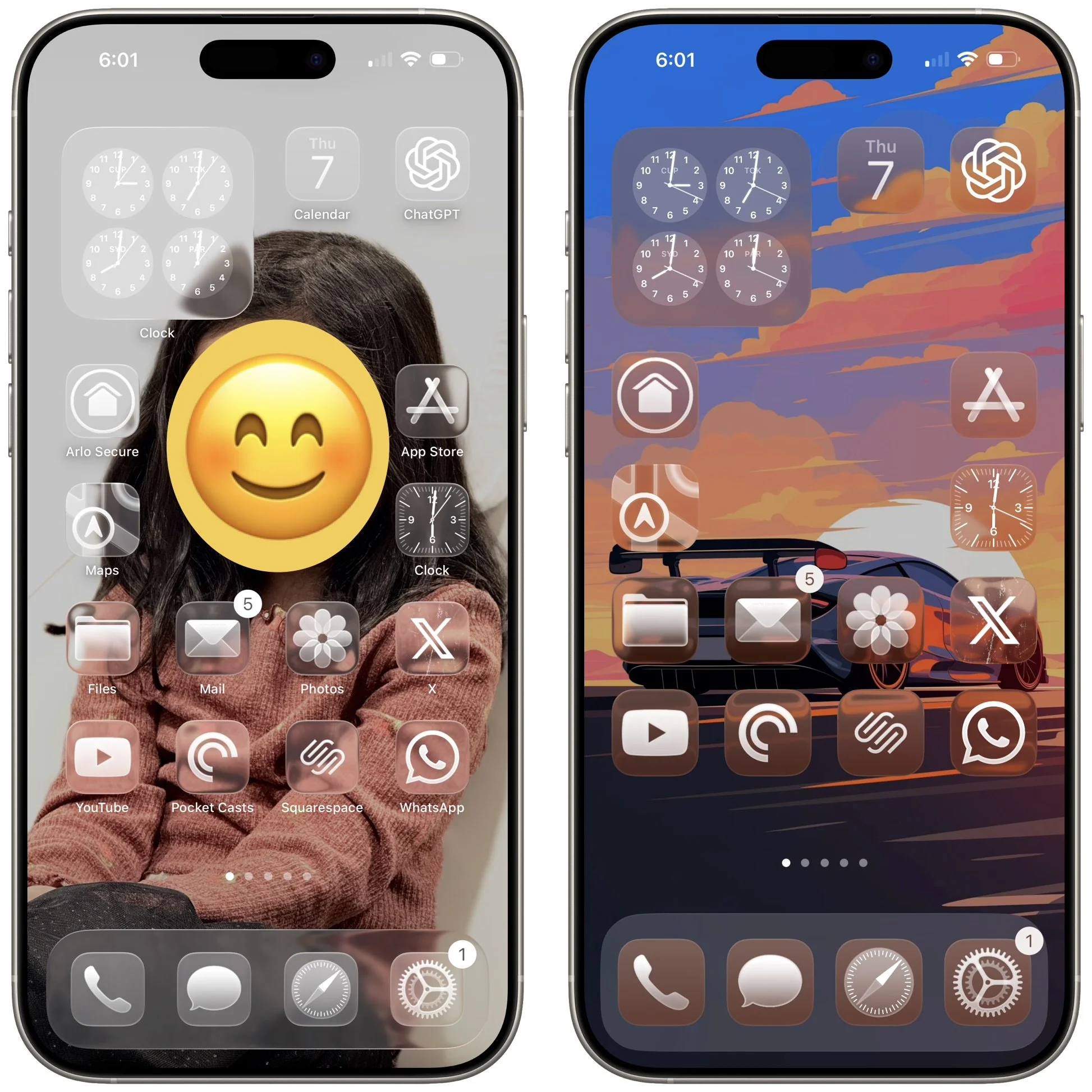
Icon placement needs to be unique for each wallpaper on iOS.
Icon customization has improved over the last few iterations of iOS. You can customize each of the following attributes:
Icon size
Truly placing icons anywhere on your Home Screen
Icon color (default, dark, clear, tinted)
When you switch wallpapers, your icon size and color can be different for each, but your icon placement always stays the same. It would be nice to have custom icon placement for each wallpaper so you can actually see the people or objects in the background.
I can see my daughter clearly in this photo, but I can’t see my future ride.
Icon customization has improved over the last few iterations of iOS. You can customize each of the following attributes:
Icon size
Truly placing icons anywhere on your Home Screen
Icon color (default, dark, clear, tinted)
When you switch wallpapers, your icon size and color can be different for each, but your icon placement always stays the same. It would be nice to have custom icon placement for each wallpaper so you can actually see the people or objects in the background.
I can see my daughter clearly, but I can’t see my future ride since icon placement for each wallpaper is not customizable, yet.
Amazon’s app lets you save your returns to the Wallet app.
Not sure when this update was rolled out, but it’s a heck of a lot easier now to keep track of your Amazon returns. I started two returns recently, and I was given the option to add the barcode into the Wallet app.
No more random screenshots with barcodes scattered in my Photo Library.
Not sure when this update was rolled out, but it’s a heck of a lot easier now to keep track of your Amazon returns. I started two returns recently, and I was given the option to add the barcode into the Wallet app.
No more random screenshots with barcodes scattered in my Photo Library.
Comparing icons: iOS 18 vs iOS 26
9to5Mac has a nice comparison showing the updated icons. Of course all the new icons have Liquid Glass inspiration, but the Clock icon is by far the best upgrade we get.
9to5Mac has a nice comparison showing the updated icons. Of course all the new icons have Liquid Glass inspiration, but the Clock icon is by far the best upgrade we get.
The Files app conundrum in iOS 26 has been solved (for real this time).
I jumped the gun and didn’t tinker around hard enough yesterday, but you can get the default, Quick Look view back as your default in the Files app:
Tap and hold on any file type in Files.
Select “Open With.”
Select “Preview with Quick Look.”
This will immediately make all files with that extension open with Quick Look by default.
The Files app conundrum in iOS 26 continues.
The Files app is very versatile, but having to go through multiple steps just to look at a file, photo, video, etc., adds to the complexity of a very capable yet simple app.
Instead of tapping a file or photo to view it, now you have to tap and hold and select Quick Look in order to view said file or photo without exiting the app. I deleted the Preview app so I wouldn’t have to deal with this issue, and it worked for a while, until I realized that different file types open in different apps that you have installed:
If you tap a PDF - it opens Preview as the default. If you delete Preview, then it opens in Apple’s Books app.
If you tap an image file - it opens in Preview, but if you delete Preview, it opens in the Files app like iOS 18.
If you tap a video file - it opens in VLC by default, but if I delete VLC, it opens in Files.
I can live without the Preview app, but I don’t want to delete Books, VLC, and whatever other app that also opens documents, videos, etc.
The UI should be the other way around. A standard tap should open the respective file in Files, and a tap and hold should bring up an “Open with…” option to select another app of your choice.
How to properly backup your iPhone before installing iOS 26.
Before you install iOS 26 on your iPhone, follow this procedure to backup your device:
1. Update all your apps to the latest version in the App Store.
2. Force quit all your apps in the app switcher.
3. Restart your iPhone to remove any software gremlins running in the background.
4. On bootup, backup your iPhone to iCloud.
5. Install the most current version of iOS 18 on your device. This is in case iOS 26 becomes a problem for you and you need to revert back to iOS 18.
6. Once the latest version of iOS 18 is installed on your device, repeat steps 1 thru 4, and then finally install the iOS 26 public beta.
There is no 100% failsafe solution, but this method has always worked for me and gave me a reliable backup to go back to, even though I never needed it.
iOS 26 alarm for people who actually want to wake up.
Couldn’t have made it better myself. The current version is not foolproof. 📓
Couldn’t have made it better myself. The current version is not foolproof.

Source: Soren Iverson
The Files and Preview app conundrum in iOS 26 (solved).
One of my readers pointed out to me something I didn’t even think of trying, but it solves the Files and Preview app conundrum:
You need to click and hold on a file, in the menu that pops up you select Quick Look. Then you can swipe between files. You will also get a pull down menu to the left, where you can choose between the files in the selected folder.
It is an extra step from before, but a lot better than no solution at all. Thank you Jörgen!
One of my readers pointed out to me something I didn’t even think of trying, but it solves the Files and Preview app conundrum:
You need to click and hold on a file, in the menu that pops up you select Quick Look. Then you can swipe between files. You will also get a pull down menu to the left, where you can choose between the files in the selected folder.

It is an extra step from before, but a lot better than no solution at all. Thank you Jörgen!
The Files and Preview app conundrum in iOS 26.
Every time I open a file or a photo in my Files app, it automatically takes me to the new Preview app. The problem with that is you can no longer swipe between files or photos in the Files app. I keep certain photos off my camera roll (no not those kind), such as really old kids’ photos from my wife’s old phone, but I can’t even scroll through them like I used to. Quite literally every time I click on a file, it goes to the Preview app.
Same thing goes for the Preview app. If I try to open the same folder of photos in the Preview app, you can’t scroll between photos in any folder. You’re stuck looking at photos one at a time. Tap a file, look at it, tap back, and tap the next file.
The only way to solve this problem right now? Delete the Preview app.
I think Apple needs to let you view your files in the Files app like it used to, and if you want to open it in the Preview app, add that option to the share sheet.
New alarm design in iOS 26 might make you oversleep.
Tim Hardwick from MacRumors (click link to see the controversial change):
In the iOS 26 beta, Apple has redesigned the alarm screen in the Clock app, giving it a cleaner look with a larger time display and significantly bigger buttons. When the alarm goes off, you'll now see two large, equal-sized buttons for Stop and Snooze placed side by side at the bottom of the screen.
While the redesign fits with Apple's broader visual refresh in iOS 26, it also seems to address a problem the company had already solved: reducing the chances of you hitting Stop instead of Snooze when you're half-awake and fumbling for your phone. Ironically, internal testing once showed that making both buttons the same size actually made that mistake more likely.
According to Jack Fields, a former Apple engineer and head writer at Kernel Extension, the new layout contradicts internal research he was involved in during his time at the company. That testing included a version of the Clock app that logged user interactions to a heat map, tracking exactly where people tapped the screen upon waking.
"It was recording where our sleepy hands were smacking around on the screen in order to see how accurate we were in turning off the alarms," says Fields. What they found was perhaps counterintuitive: when Stop and Snooze were made the same size and placed close together, users were 30% more likely to hit Stop by accident. In other words, it actually increased the chances of oversleeping.
This will change 100%. Apple should keep the fat SNOOZE button and place it higher, and make the STOP button small and lower like it was before.
Another reason why I have 5 or 6 alarms for my unorthodox sleeping pattern.
Bringing back the Library in the Photos app is today’s “flush headphone jack” moment.
Say what you want about Liquid Glass. Whether you hate it or love it, what is no doubt a victory for everyone (unless you’re clinically insane) is the return of the Library in the Photos app. A staple feature that was always present from the beginning of iPhone was harshly taken away from us in iOS 18, only to return to its former glory.
The Library is like the Home Button for the Photos app. Simply tap the Library to see everything in chronological order. No more frustration in sorting between your recent Collections only to be frustrated trying to find photos you took just a few days ago.
If WWDC was a true live event, you would have seen people cheer when they saw the clip showing the return of the Library, exactly like when the flush headphone jack was announced with the iPhone 3G.
The iPhone (aka iPhone 2G), debuted with huge fanfare, but it had one glaring hardware issue, which was a recessed headphone jack. That meant any headphone jack with a wider diameter plug just wouldn’t work with your iPhone, the ultimate iPod. Every iPod prior to the iPhone had a flush headphone jack and you could use any pair of headphones with it, but now all of a sudden your special headphones were not compatible. You needed a 3.5mm to 3.5mm adapter in order to use your non-Apple headphones. Back in those days, I had a Nokia N95 8GB, and I would scoff at those iPhone users with their substandard headphone jack since mine was flush, even though the headphone jack on the Nokia N95 was side mounted!
It was one year of agony for early iPhone adopters (similar to iOS 18’s removal of the Library), but one that never surfaced again.1
Here’s to many more fantastic years with the Library.
1The iPhone 7 did get rid of the headphone jack, but that was justified.
Say what you want about Liquid Glass. Whether you hate it or love it, what is no doubt a victory for everyone (unless you’re clinically insane) is the return of the Library in the Photos app. A staple feature that was always present from the beginning of iPhone was harshly taken away from us in iOS 18, only to return to its former glory.
The Library is like the Home Button for the Photos app. Simply tap the Library to see everything in chronological order. No more frustration in sorting between your recent Collections only to be frustrated trying to find photos you took just a few days ago.
If WWDC was a true live event, you would have seen people cheer when they saw the clip showing the return of the Library, exactly like when the flush headphone jack was announced with the iPhone 3G.
The iPhone (aka iPhone 2G), debuted with huge fanfare, but it had one glaring hardware issue, which was a recessed headphone jack. That meant any headphone jack with a wider diameter plug just wouldn’t work with your iPhone, the ultimate iPod. Every iPod prior to the iPhone had a flush headphone jack and you could use any pair of headphones with it, but now all of a sudden your special headphones were not compatible. You needed a 3.5mm to 3.5mm adapter in order to use your non-Apple headphones. Back in those days, I had a Nokia N95 8GB, and I would scoff at those iPhone users with their substandard headphone jack since mine was flush, even though the headphone jack on the Nokia N95 was side mounted!
It was one year of agony for early iPhone adopters (similar to iOS 18’s removal of the Library), but one that never surfaced again.*
Here’s to many more fantastic years with the Library.
*The iPhone 7 did get rid of the headphone jack, but that was justified.
This editing feature in Photos will save you tons of storage.
If you crop a video and select “Save Video,” the storage size of your video won’t decrease. You have to select, “Save Video as New Clip” to get a reduction in file size, and then delete the original video.
The “Save Video” option crops your video, but still retains the whole video in case you change your mind. When you go back to editing the video under the “crop” option, you will see the entire video with your cropped selection. I had a 10GB slow-mo video that was 42 minutes long, but I only needed 1 minute from it. After cropping my video and selecting “Save Video,” the file size was still 10GB. I was sure I didn’t need all that extra footage, so I selected, “Save Video as New Clip,” and then deleted the original 10GB video.
My new file size? 342MB.
How I am preparing to test iOS 26 next week.
iOS 26 will be the biggest makeover since iOS 7, and if you remember those days, the first developer betas were brutal if you used them on your primary device. Our phones have become more and more a 3rd arm that we must have, and it isn’t wise to put any developer beta on your primary device.
At least the first few.
For that reason, I have obtained an iPhone 13 mini as my testing device, which I picked for several reasons:
I wanted to see how well optimized iOS 26 will be on Apple’s smallest screen.
I had an iPhone 12 mini in the past, and this will be a nice flashback to a more comfortable form factor.
The iPhone 13 mini supports FaceID in landscape among other improvements and is only a few bucks more expensive than an iPhone 12 mini.
I still use a physical SIM card, so I needed an iPhone with a physical SIM in case I decide to change primary devices. I flew to Canada to buy a 16 Pro Max last year to get the SIM slot version, so I can easily swap if needed. This way I have an easy out and won’t be stranded without cellular function no matter how unstable my phone is. There’s nothing worse than unstable beta software and trying to port your eSIM out to another phone.
Just a few more days to go!
Swipe-up and “throw” lock screen shortcuts back to their spot with iOS 18.
Shortcuts on the bottom of the iPhone lock screen were always mapped to either the Flashlight or the Camera. With iOS 18, you can change those to a wide variety of shortcuts. Most app-opening shortcuts will end with you swiping up to leave that app, and you end up on your home screen. If that same app is one of your default home screen apps, it will “fly back” to its spot on the grid. If it’s not one of your default home screen apps, it will just fade away and leave you at your home screen. Standard practice.
There is a way to see that “fly back” animation that didn’t exist until now, but it only works on Capture shortcuts (minus the default Camera app). If you scroll down to the Capture section of the shortcuts options, swiping up on these apps triggers the “fly back” animation, returning the icon to its lock screen shortcut position. The first time I saw it, it was surprising to see an icon that isn’t a rounded rectangle behave like one.
This behavior does change the more you interact with these “Capture” apps from the lock screen. A swipe up to leave the app will then put you at your home screen.
In Halide for example, if I take a photo and swipe up to leave the app, the Halide app icon will fly back to its spot on the lock screen depending on my speed and direction of my swipe. If I take a photo and decide to view the photo in full screen by clicking on the thumbnail in the corner, a swipe up will take me to my home screen and the app will fade away.
Quickly disabling biometrics on Android is literally several steps behind iOS.
Imagine if your car required you to slam on the brakes as hard as you can and tap an “anti-lock brakes” button on your infotainment screen in order to activate the anti-lock brakes.
That’s essentially what Android phones require you to do in order to quickly disable biometrics. It is not an intuitive, one-step process on Android like it is on the iPhone.
First, you have to enable Lockdown Mode in Settings by either searching for “Lockdown Mode,” or going through a menu tree depending which Android phone you have.
That is assuming of course, your Android phone even supports it.
Seems like Samsung requires you to enable Lockdown Mode first through this menu tree, but it’s a one-time operation so I’ll let that pass. Once you have done that, you can hold the power button until you get to the power menu screen, and then tap the Lockdown button.
On Pixel phones, if your power button isn’t tied to Google Assistant, you can press and hold the power button to get into the power menu, and then select Lockdown. If your power button activates Google Assistant like an iPhone’s power button activates Siri, then you have to press and hold volume up and the power button and then you enter the power menu and have to select Lockdown.
You don’t get a one-step method like iOS, where a simple press and hold of the Power Button on one side of the device, and any or both volume buttons on the other side of the device (essentially squeezing the phone) automatically disables all biometrics. Just press and hold for a full 2 seconds, and that’s it.
No touchscreen input required.
If you have Haptics turned on, you also get a vibration to confirm your button inputs were successful. Personally, it’s best to enable Haptics to give you more reassurance.
Haptics or not, the point is you don’t have to look at your iPhone’s screen and confirm anything with a touch, which in my opinion defeats the purpose of quickly securing your device. That I won’t let pass.
You also don’t have to think about which volume button to press on an iPhone, since either one (or both together) will work. Just squeeze the damn iPhone and you’re good.
Odds are if you are in a situation where you have to do this, you’re already distraught to some extent, and might not have the time to even touch your screen if someone grabs the phone out of your hands fast enough.
Once again, assuming you even enabled Lockdown Mode.